How to Design a Single-Line Queue That Feels Fair and Fast
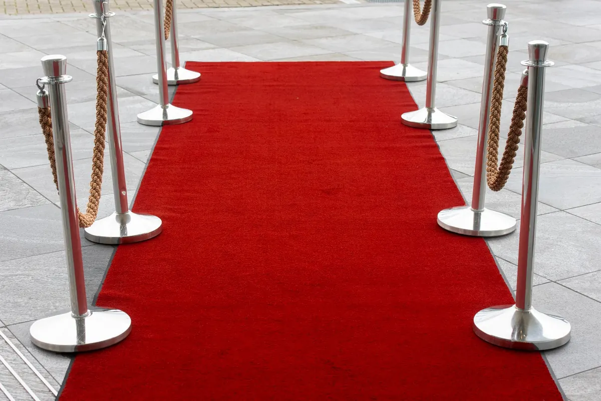
A single line makes a promise: first come, first served. Designed well, people believe that promise without being told. Designed badly — tape curling off the floor, a rope that ends nowhere, two entrances and no referee — the same promise collapses into guessing games and quiet resentment that outlives the receipt. The fix is mostly geometry, not policy. A marked entry, a well-shaped snaking path, and service points people can actually see will do most of the crowd control for you.
Why one line feels fairer than several
Multiple lines look efficient on paper and feel like a lottery in practice. Somebody in the shorter queue spends six minutes on a complicated request while yours crawls. You picked the wrong line. Everyone can see it, and nobody enjoys that feeling.
A single queue feeding several counters removes the gamble. People stop comparing, stop jockeying, and stop watching the other line with suspicion. There is a second benefit that matters more than fairness: the line keeps moving. A queue that shuffles forward a step or two every minute feels far shorter than a stationary one of identical length. Movement is the illusion you want to protect, and a single funnel protects it better than any other layout.
Measure the space before you buy anything
Walk the route at your busiest hour, not at nine in the morning when the floor is empty. Note every fixed obstacle: pillars, socket covers, fire exits, cleaning cupboards, the swing of the entrance door, the spot where deliveries arrive.
Then check the dimensions you are working with:
- Lane width: roughly 90 cm to 1 m for people standing in place and stepping forward. Go wider, closer to 1.2–1.5 m, wherever customers carry carts, trays, luggage, or strollers.
- A bypass aisle: leave a clear route so someone who is not joining the line can walk past it without apologising their way through.
- The accessible route: it should never run through the back of the queue, and it should not be the bypass aisle either. Check your local accessibility requirements before you fix barrier positions, or bring in someone who knows the code.
Sketch the path on paper first. Rope is cheap; rebuilding a queue layout after customers have learned it is not.
Shape the snaking path on purpose
A switchback line is just a straight line folded so it fits. The fold is what lets a forty-person queue occupy the footprint of twelve.
Keep each run long enough to matter
Aim for straight sections that hold eight to twelve people comfortably. Very short runs create constant turning, which slows the shuffle and makes the line feel jerky instead of flowing.
Give turns room
Tight corners are where people bunch up, bump bags, and lose their place in the conversation with whoever they came with. Space stanchions so a person can step into the turn without touching the barrier on either side. Keep the final turn back from the counter by a metre or two, so the next customer has somewhere to stand without breathing down the current one's neck.
Mark the start and the end
An unmarked line end invites the oldest mistake in queueing: people forming a second, informal line beside yours. A "line starts here" sign at the entrance and a visible end marker finish the job that the barrier begins.
If the person at the front of the line cannot see where the line ends, neither can the person about to join it.
Make the service points obvious
The queue should be able to answer one question without asking anyone: where do I go next? Number the stations, and use a single call — "next, please" or "counter three" — every time. Keep the counters themselves visible from most of the line. If a wall, display rack, or plant blocks the view, people at the back start drifting forward to check, and drifting is how queues unravel.
Signage helps, but only if it is readable from standing height, in the direction people are actually looking. One message per sign beats five lines of small print. And close down counters properly: a vacant window that still looks open will pull people out of the line all day. Run a chain or a blind across it, or turn the light off.
Cues that quietly stop cutting
Most cutting is not aggressive. It is confusion — someone entering from the side, someone who left to grab a forgotten item, someone with "just a quick question." Design for all three:
- One entry point, clearly marked, positioned away from the door swing and away from the counter where people pay.
- No gaps in the barrier run. A gap of two metres reads as an invitation.
- A small holding area or an agreed rule for customers who step out — usually: ask staff, and they will slot you back in.
- A separate spot for quick questions, so short enquiries stop interrupting the main line.
- Staff who acknowledge the line with a nod or a "be right with you." Being seen is most of what people are waiting for.
Watch it run, then adjust
Stand at the side during a genuine rush and watch where the line stalls. Is it at a turn, at the counter, at the entrance? Time a handful of customers with your phone, roughly, and see whether the wait matches what you assumed. Change one thing at a time so you know what worked.
Ask the people who work the counter. They see the same bottleneck every shift and can usually name it in one sentence. Refresh floor tape and decals every few months — faded markers stop being instructions and start being decoration.
A short checklist before you open
- One marked entry, one clear path, no side merges.
- Barrier runs continuous, with no inviting gaps.
- Lane width wide enough for the widest thing your customers carry.
- Accessible route kept separate and clear.
- "Line starts here" and end marker both visible.
- Every open counter identifiable, every closed one unmistakably closed.
- A written rule for people who step out of line, and for quick questions.
None of this requires new software or a bigger budget. It requires deciding where the line goes and then making that decision visible from every point along it. Do that, and the queue stops being something customers have to manage and goes back to being something they simply stand in.
Photo: Jan van der Wolf / Pexels